Introduction
What if your body felt stressed, but you didn’t realize it until the next day? For people with Persistent Physical Symptoms (PPS), this is reality. Stress doesn’t just affect their mood—it amplifies pain, fatigue, migraines, and more. But today’s wearables offer little clarity. So, how might we visualize stress in a way that actually helps people understand it?
That question guided our work as we partnered with the developers of the Moodmetric Ring, a wearable that tracks stress levels in real time. Our goal: design a visualization-focused mobile interface that empowers users with PPS to recognize stress triggers and patterns without judgment or confusion.
Phase 1: Researching the People Behind the Pain
We began with a deep dive into the lived experiences of people with PPS. Through a literature review and 18 interviews, we explored how chronic symptoms impact their lives and how they currently manage stress. We then used affinity mapping to identify patterns, which informed our persona development and user requirement list.
Key insights included:
Users often only notice stress after physical symptoms arise
Existing apps feel confusing due to unclear terminology and abstract visualizations
There is a need for clarity, personalization, and emotional tone control
Desired features ranged from calendar integration to personalized relaxation tools

Phase 2: Mapping Needs to Design Opportunities
Based on the research, we defined a focused feature set. The core experience had to show stress in real time, compare it to a personal baseline, and link stress patterns to specific life events. To prioritize features, we applied a MOSCOW analysis:
Real-time stress visualization
Daily/weekly/monthly stress overview
Calendar-linked stress events
Baseline tracking
Long-term pattern recognition
Optional heart rate and sleep data integration
Contextual tips and motivational prompts
Future potential: Spotify integration and community features
To ground the design process, we created user stories. One example: "As a user, I want to see how my stress changes during the day so I can link it to moments that matter."
Phase 3: Visualizing the Invisible
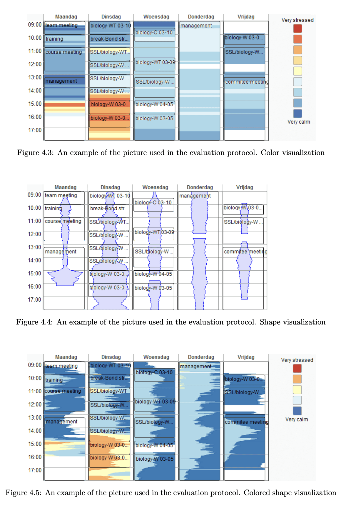
To break away from vague charts, we looked at visual strategies from other fields—energy dashboards, sports analytics, flight dashboards. These helped us design visualizations that simplify complexity and give users meaningful context.
For example, a stacked graph inspired by energy dashboards allowed us to show baseline vs. actual stress levels over time, giving users a clearer comparison. The stacked bar graph is great for showing multiple data in one overview (Lunga, 2014). In this case, the energy usage and the target energy usage over the same period are shown in one graph. In our case, it could be used to show the current tension-, sleep-, and heart level and their average over time.

A Master's Thesis titled "Stress data visualization" by Sofia Semikina from the Eindhoven University of Technology focuses on the visualization of stress data about everyday life events to better understand and manage stress (Semikina, 2014). The thesis identifies a problem with existing stress data visualizations, which present stress level data in isolation from information about life events. This makes it difficult for the user to understand and learn from their stress data.
Phase 4: Designing the First Prototype
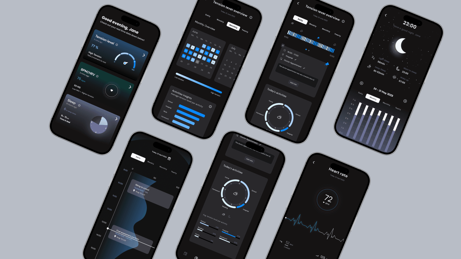
We turned our insights into a clickable medium-fidelity prototype in Figma. The app includes a clean dashboard with real-time stress readouts, a color-coded graph, and tapable peaks that reveal stress-inducing activities via calendar syncing. It also allows users to review stress trends over time.
What makes the concept unique is its direct connection between stress and everyday activities. By showing how stress relate to specific events, users gain insight they can actually use.

Phase 5: What Makes This Different
Unlike previous apps, which often confuse users with abstract shapes or unexplained color schemes, our design is approachable, labeled, and emotionally neutral. Users can customize the experience to suit their preferences, making the interface not just a tracker, but a personal guide.
Reflection
This project deepened my skills in qualitative research, interaction design, and data storytelling. I learned how to turn personal struggles into interface features, how to test assumptions quickly, and how to borrow design language from unexpected domains to solve health problems.
Key Contributions
Led user interviews and affinity mapping
Defined UX priorities and design logic
Designed the prototype in Figma
Connected wearable data to daily routines through interface storytelling